Removing features, noise and buttons to make your product perfect
Today I visited our local Apple store to finally "feel and touch" the new Mighty mouse - world's first multi-touch mouse. Man, it's a beauty and pleasure to play with:
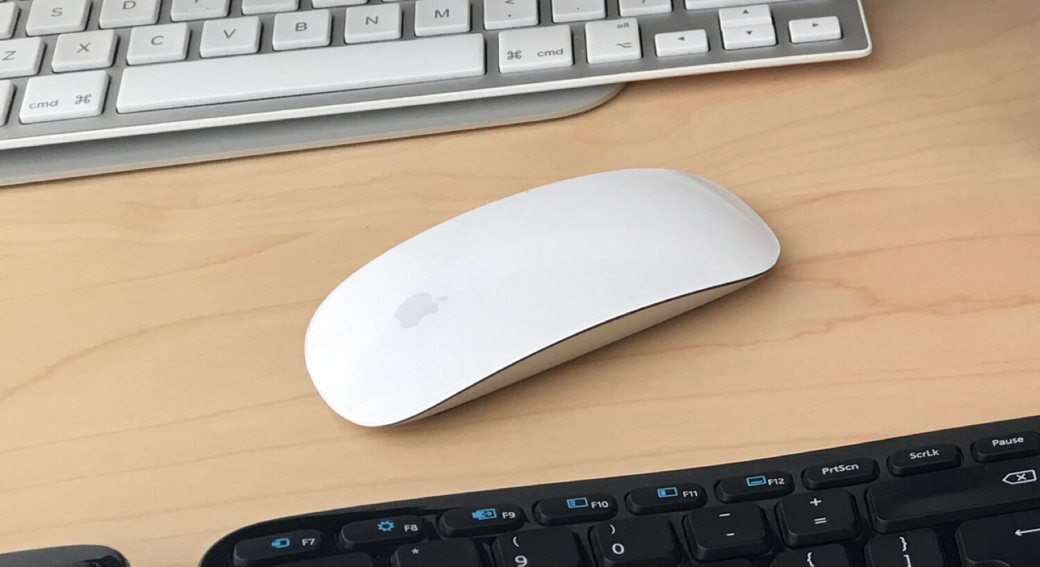
This tiny mouse looks like one of the most powerful mice in the world and yet...... it has no buttons and no scrolling wheels!So it basically lacks everything you'd expect from a mouse.And yet it's so powerful!And this doesn't mean you have to learn to use this mouse. Not really. Just move it around, click, scroll, right-click... Same old same old.
Plus it has new gestures even!This the typical Apple genious - remove noise, remove unnecessary buttons but improve the user interface and the way stuff works "behind the scenes".In the world where all mice manufacturers where adding buttons, scroll wheels, etc. - Apple removed them altogether.As a startup owner/founder my goal with Nozbe 2.0 was to do the same thing: remove noise, remove buttons, sliders, dropdowns...And yet when I look at it I see there is still a lot that can be done... So I decided to do "weekly reviews" of Nozbe in a search for something to remove.
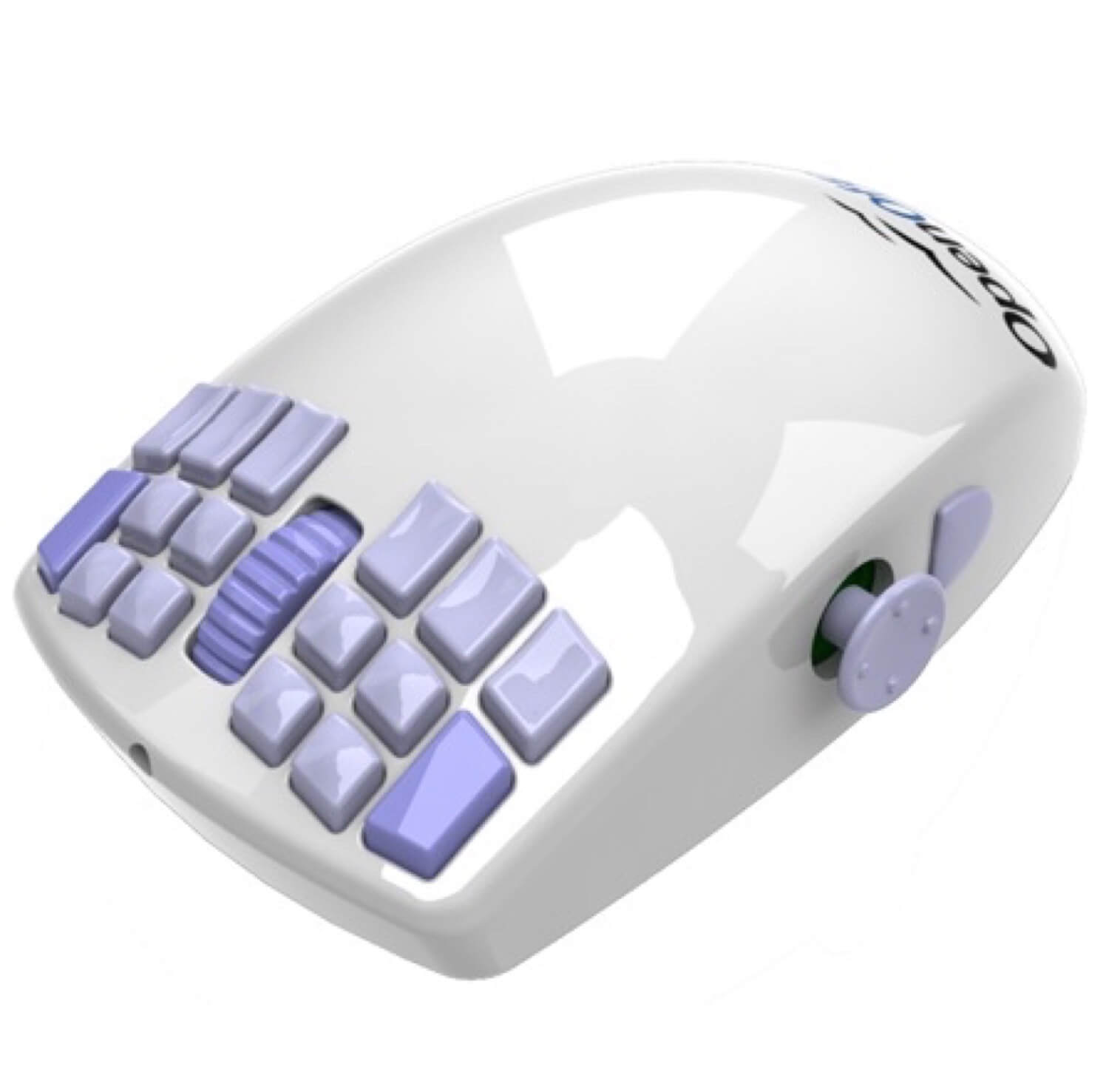
That's right. I'll be removing stuff from Nozbe. Literally.Follow Apple's advice:Keep removing noise while adding new features.
Make stuff work "behind the scenes" and not "in your face".
Question: Which product has made your life simpler lately? If you're a Nozbe user, which stuff you don't want to see on your screen?
-->I'm Michael Sliwinski and I'm an entrepreneur who's also the...
.. Founder of Nozbe.com - a time and project management web application
.. Editor of Productive! Magazine - a global PDF publication on productivity
.. and a blogger as well as a producer of a weekly 2-minute Productive! show.
7 comments
A few ideas...
The drag and drop functionality you have now supports assigning contexts, projects and dates. I would love to see a design that completely removes the need to "expand" the task at all and is so intuitive that, if given an option, everyone would drag and drop. Consider the possibility, for example, of a "tag cloud" of contacts on the right hand side, dragging and dropping a task to this cloud would automatically assign the task. Selecting a contact from the cloud would display all the tasks assigned to that contact. In fact, you could do the same with repeated tasks - create a sidebar list and allow us to drag and drop. Add these features with a seamless design and you could potentially remove the need to expand the task altogether - which, in my opinion, is an uncomfortable user experience.
An additional option - keyboard shortcuts. Its perhaps the simplest way to eliminate the need to click, select...click, select...click, select....drag and drop. Also, myself, along with quite a few of your other paying users, have been anxiously awaiting this functionality.
Would be more than happy to beta test any design ideas in this direction!
One potential issue with expanding drag and drop would be the sidebars getting overcrowded. Using the "Contact cloud" as an example, I would like to have the option to minimize this section because I use contexts more often and I want it removed from my visual landscape until I need it.
When processing my inbox, I would like to drag a task over to the "Contact Cloud," and have it expand as soon as I am hovering over it, allowing me to drop the task onto the appropriate contact.
When reviewing my delegated tasks, I can then expand the "Contact Cloud" and conduct a review.
The same design principle could be applied to "repeated tasks." I would really wouldn't want to see a permanent list of "picklist values" on the sidebar just to take advantage of drag and drop. I would likely keep this section permanently minimized unless I wanted to review my tasks by their frequency.
In regards to keyboard shortcuts:
- new task
- new task (enter multiple)
- next task in a list
- previous task in a list
- delete task
- view comment
- create comment
- next project
- last project
- star project
- open weekly review
- open next actions
- new project
- promote task to project
- open calender
- next week
- prior week
- open project labels - then tab to select a labels
The "drop zone" sounds right on the money. Would be happy to beta test / comment on any designs!


